Microsoft Excel has been around for over years, but its data visualization capabilities have never been better. I will start with a few of the most common chart types and excel enhanced them with interesting features, then move on to the most recent additions. Some of the major topics that we will cover include inserting and changing charts. And there are several ways to do this in Excel. Working with multiple data and different colored elements using trendlines and secondary axes to enhance an existing chart and creating special chart types like the Tree map on boxing Whisker chart.
Prerequisite: Know what is excel cell data and worksheets.
Microsoft Excel offers some very powerful charting tools, which could be used to help you see your data and a completely different way in this module.
Five of the most common chart types in Excel
- Bar chart
- Column chart
- Line Chart
- Area Chart
- Pie chart
Bar chart
The bar chart is a simple yet effective visualization in which each of the categories are displayed along the vertical axis, the width of each rectangle or bar corresponds to the value for that category, showing clawing the horizontal axes.
Because the bars and categories are independent of one another, their order could be changed in such a way that they might help you bring attention to specific data points.
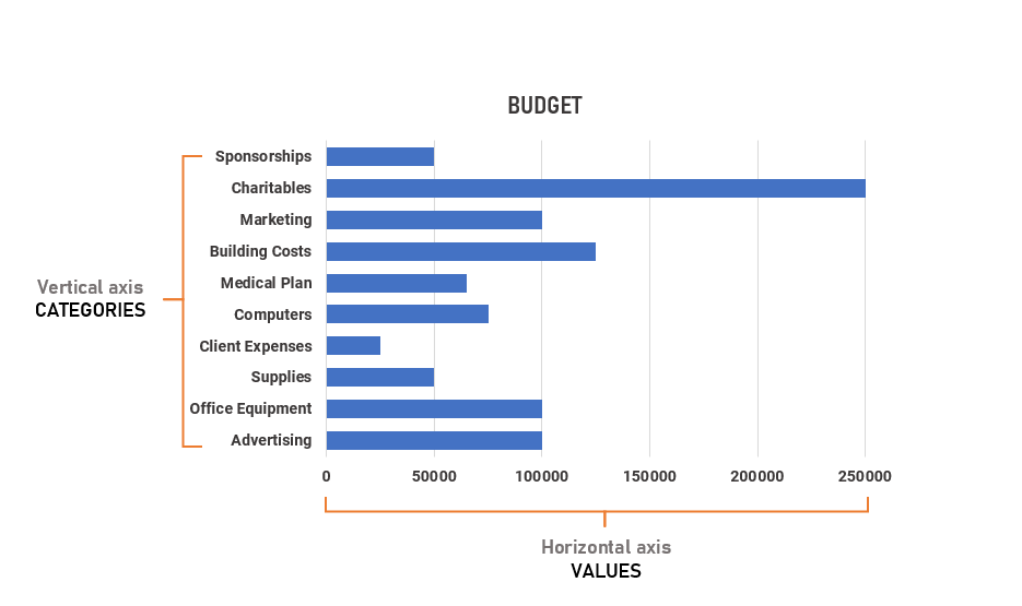 We can also reorganize the data to show the category values in ascending order, or descending if it is more suitable.
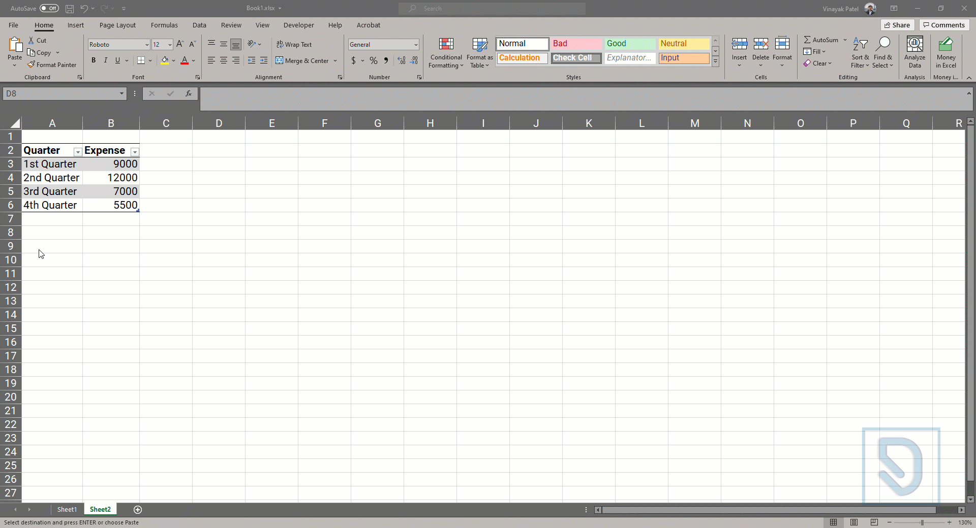
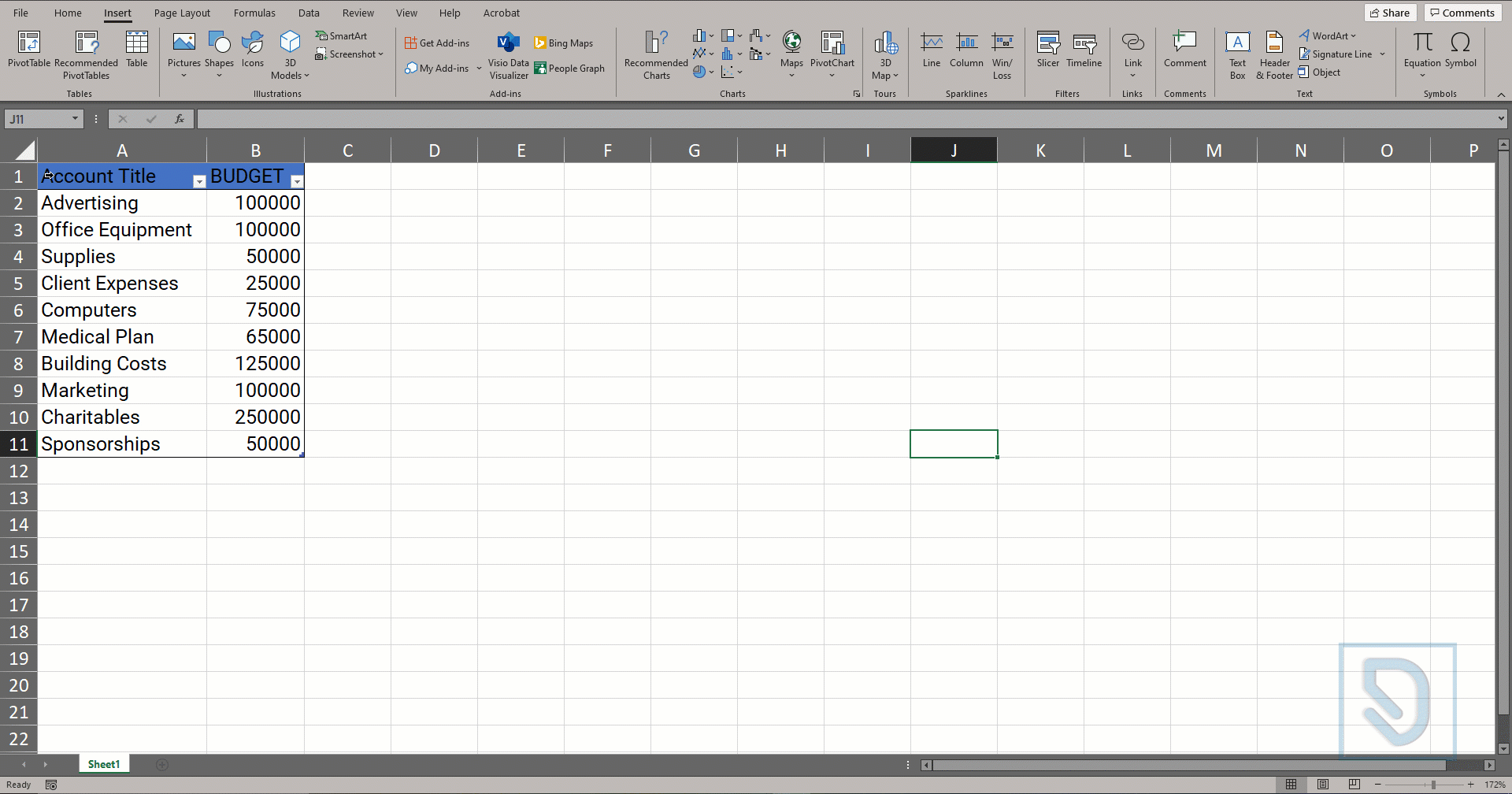
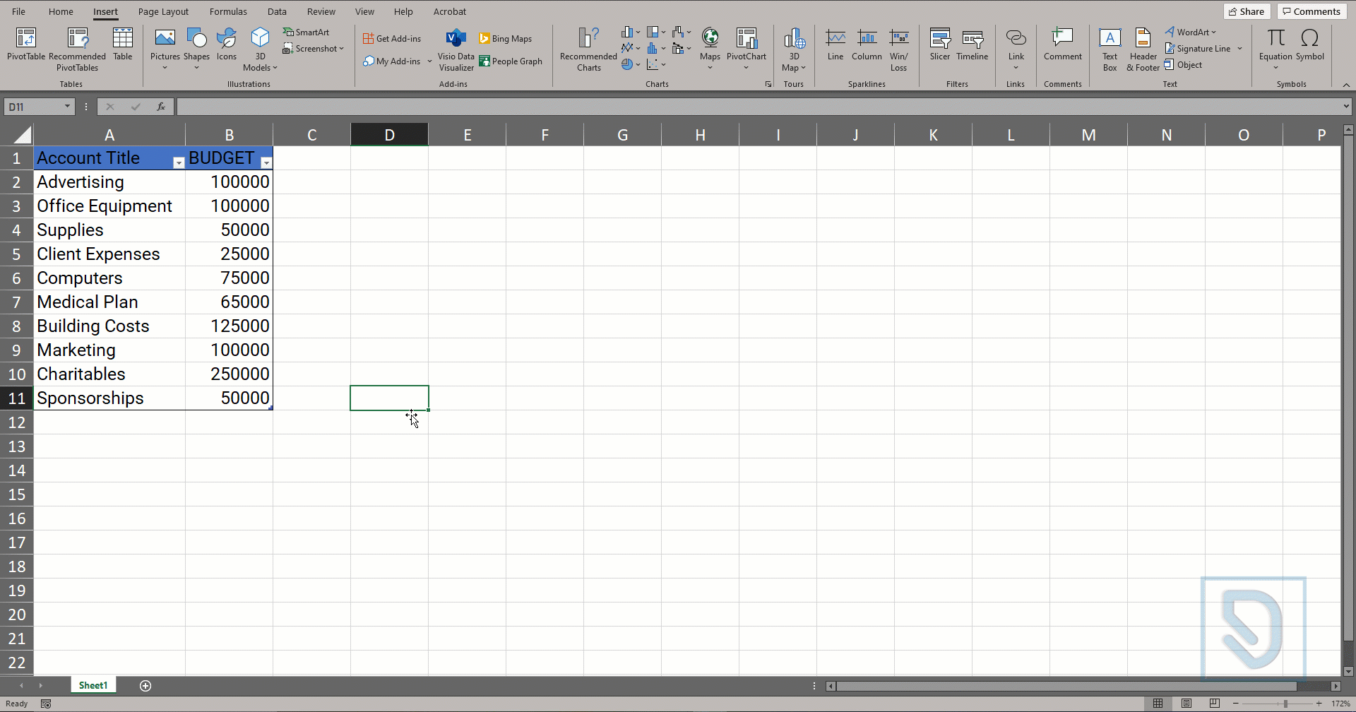
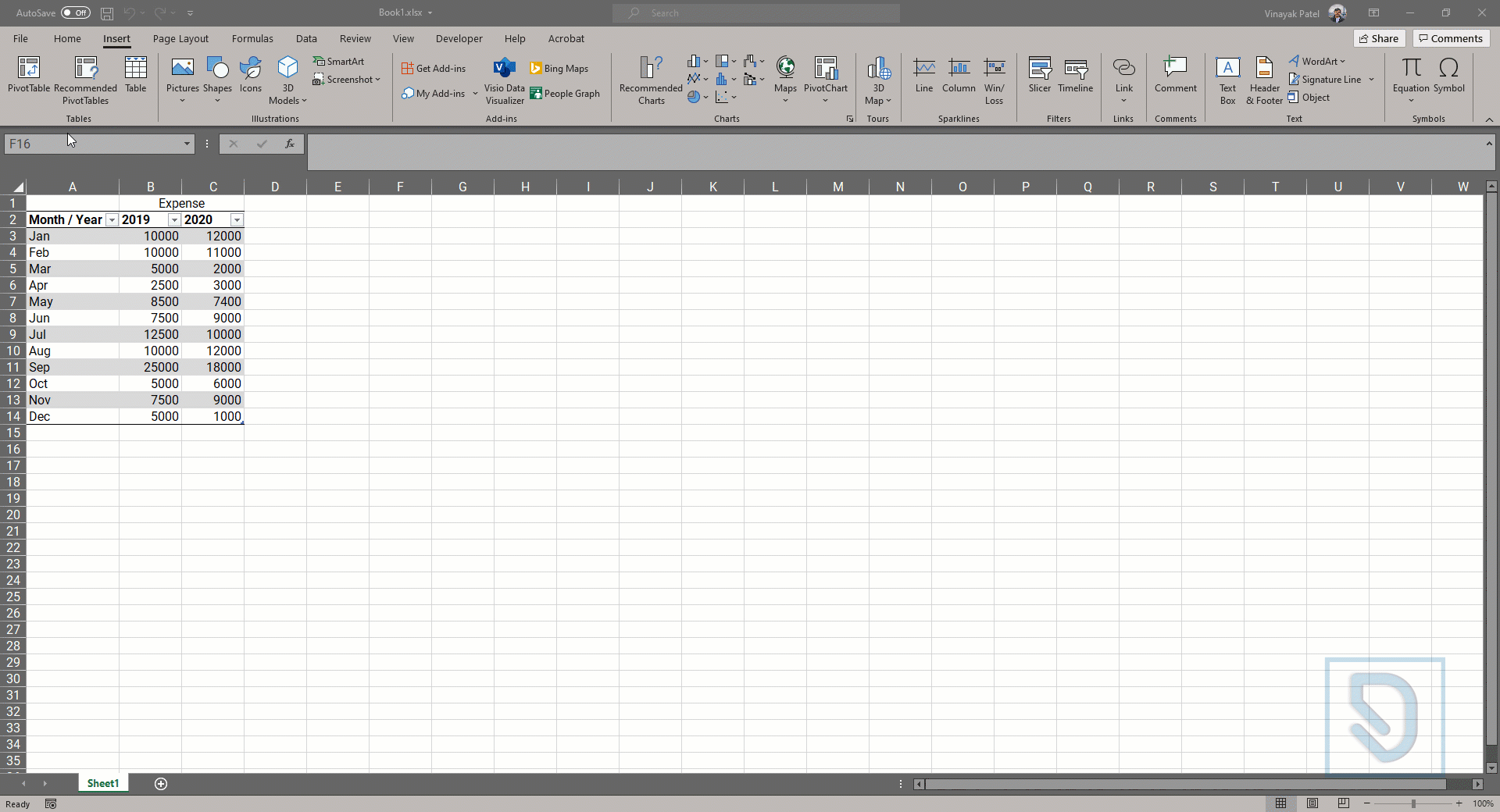
First, I’ll start by selecting the top left cell in the table. Excel does a great job of detecting data tables and automatically selecting category and value headers. So it helps if we can tell it where the table starts. When we go to create our chart and the insert ribbon tab, there’s a group for charts. I’ll click on this one, which is for column and bar charts and also like the 2D bar chart.
Bar charts are a type of graph that are used to display and compare the number, frequency or other measure (e.g. mean) for different discrete categories of data.
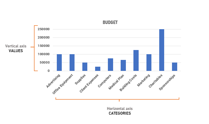
Column chart
The column chart is a similar visualization like bar chart in which each of the categories are displayed along the Horizontal axis, the width of each rectangle or bar corresponds to the value for that category, showing clawing the vertical axes.
Because the bars and categories are independent of one another, their order could be changed in such a way that they might help you bring attention to specific data points.
Select Cells > the insert ribbon tab, there’s a group for charts
Column charts work well in showing data changes over a period of time by displaying the comparisons among subjects on an overall chart. They are often used to show data comparisons in a visual way
Line Chart
One of the best ways to illustrate how value changes over time is by using a line chart. Because each of the data points are connected, it implies continuity between values. Unlike the bar and column charts, we just looked at where the columns were somewhat discreet and isolated.
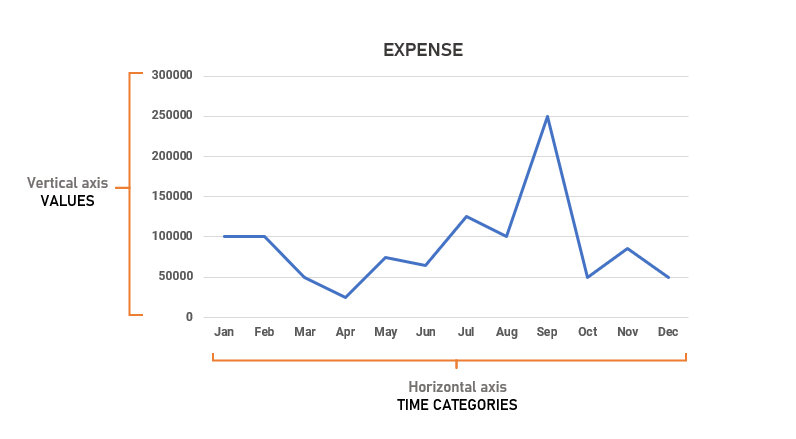 Here, you can get a sense of how one values connected to the next, and if there is a general trend in your data again, the Time categories are visible from left to right along the horizontal axis and the values from bottom to top along the vertical axis. But it’s important to note that the data points will always be connected in the order in which they appear on the chart
Area Chart
An area chart is a line chart with the areas below the lines filled with colors. Use a stacked area chart to display the contribution of each value to a total over time.
To create an area chart using the data, highlight the table and select Insert > Charts, select the Line Chart group drop-down menu and then select the 2-D Area chart option.
Pie chart
A pie chart (or a circle chart) is a circular chart, which is divided into slices. Each part (slice) represents a percentage of the whole. The length of the pie arc is proportional to the quantity it represents.
To create an area chart using the data, highlight the table and select Insert > Charts, select the pie Chart group drop-down menu and then select the 2-D pie chart option.